The Tin Roll
(THE SCREEN COMES UP WITH MULTI COLOURS, IT DOES PLAY IF YOU PRESS PLAY.)
From watching the clip back i think that i should have maybe added more rotation when the tin returns to its start position, and maybe i could have made the tins return slower. But on the whole i am really exited about it, cant wait to animate more things!!
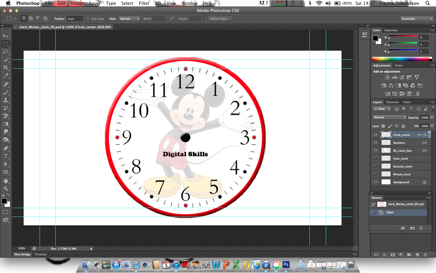
I then opened After effects and imported the photoshop file as a new composition. Due to saving it as a photoshop file it meant that i could see all of the different layers on After Effects as well as photoshop which makes it much easier to animate. Once i had opened the folder onto after effects and re-names the composition we used the 'shape tool' and made a thin rectangle to imitate the second's arm. We then had to use a 'anchor point' so that when i go to animate the layer it rotates around one point, which in this case it obviously the centre of the clock. Once i had gone this, i duplicated the layer by selecting the layer and using 'cmd+d'. This meant that i had three second's hands which all had the same anchor point, so i renamed on 'hour hand' and the other 'minute hand' and manipulated the rectangles accordingly.

The image above is a screen shot of the short animation to display the different handles.
Once i had made all of the different 'arms' for the clock i then started the animate. The duration of the animation was 6 seconds long, which is the task is to animate a clock at 5 seconds to five o'clock.
I moved the curser to 1 second on the duration time, and then rotated the second hand to 4 seconds too five and 'key framed' the image. This means that the second hand will move to the key frame after 1 second. I did this until i had animated the second hand to end at number '12'. I then did the same process to the minute hand and the hour hand, (moving the hands accordingly).
However, instead of looking like a clock, it looked more like a stop watch, the play back was so smooth it did not look right. So Jon showed us a really good way of adding some character to our clocks. On After Effects, it will make a smooth transition from key frame to key frame. I had to change this, so i copy and pasted the beginning key frame and pasted it just in front of the second key frame; i then copy and pasted the second key frame and put it in from of the third key frame. So the sequence looked like this... 1 - 1,2 - 2,3 - 3,4 - 4,5 - 5. This created a sightly jolted movement rather then a smooth movement - i only did this on the second's arm.
Still it didnt look quite right, so we i added more 'key frames' into the animation. Instead of going from keyframe 1 to key frame 2, i made the second key frame go slightly past key frame 2 and then made the third key frame, the original number two. So the sequence looked more like...
1 - 2.5,2 - 3.5,3 - 4.5-4 - 5.5-5.
I ended up with this short animation.
(THE SCREEN COMES UP WITH MULTI COLOURS, IT DOES PLAY IF YOU PRESS PLAY.)


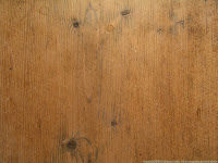 The images we were given to use are the three images to the left and the one above to the right. We opened Photoshop with the standard settings, film/video, square pixels/widescreen, this means that we can see the guidelines. We then opened all of the image files Jon uploaded onto Photoshop and added the Wood as the background layer to act as the door. From practicing with Photoshop at home i feel like i have learnt a lot in the last three weeks and felt comfortable enough to go ahead of the class and find other images that i could include, e.g. other signs and some nuts and bolts maybe a coffee cup stain and other textures that could be really interesting.


