Friday 23 November 2012

O'Keeffe facts

“I found I could say things with color and shapes that I couldn't say any other way - things I had no words for.” 
- Georgia O'Keeffe

Georgia O’Keeffe, Blue Flower, 1918. Pastel on paper mounted on cardboard, 20 × 16 in. (50.8 × 40.6 cm) Georgia O’Keeffe Museum, Santa Fe, New Mexico; gift of The Burnett Foundation. © Private collection via whitney.org
  • O’Keeffe lived from 1887 to 1986. She was 98 years old when she died.
  • She is known for her paintings of flowers, bones, shells, stones, leaves, trees, mountains, and other natural forms.
  • She made over 200 flower paintings.
  • In 1928, six of her calla lily paintings sold for $25,000, which was the largest amount ever paid at the time for a group of paintings by a living American artist.
  • In 1929, O’Keeffe took a vacation to Taos, New Mexico where she fell in love with the open skies and sun-drenched landscape.
  • She was given a one-woman exhibition in 1946 at the Museum of Modern Art in New York — the first given by that museum to a woman.
  • Her major retrospective in 1970 at the Whitney Museum of American Art, placed her as one of the most important and influential American painters.
  • O’Keeffe’s vision deteriorated in 1971 and she withdrew from artistic life.
  • She resumed painting in 1973 when she met Juan Hamilton, a young ceramic artist, who assisted her with her work.
  • O’Keeffe’s illustrated autobiography GEORGIA O’KEEFFE was a best seller in 1976.

Thursday 22 November 2012

Sea Horse Task - Masks.

Today we were carrying on with After Effects, we were given a few instructions, to go onto the internet, and get a image of a fish or something from the sea and then import it to After Effects. The main aim of today is to learn about masking, how to make a mask, how to make the mask move, and how to make the transitions smooth. My image was this seahorse:

 Once we imported out chosen image onto AE we set about making a mask for the shape. However, before we did that we had to make a layer  which we block coloured so we could make the mask out of their layer. There are many different mask tools on AE, you can use the shaping tools which make basic masks in the shape of a rectangle, circle, oval etc or you can use the pen tool, you can have a (-) or a (+) vertex which means that you can make a mask that can mask what ever is inside of the mask or outside of the mask.

Due to the bumps and all of the curved edges of the seahorse silhouette it wouldn't get a good idea to use a shape mask as it wouldn't catch any of the detail. I had to use the pen mask, however, when i initially made the mask i made so many points in the mask that it would have been rather labour intensive to move all of the individual points. Jon showed me a clever and rather easy trick to make less points. When you click to make a point hold it down and then you can make the like curved, it means that you can dramatically reduce the amount of points - make it easier to animate, as well as making it less complicated. However, i found that when i went to move the points later on, due to the curve of the line i had put in place, it was difficult to get rid of the initial curve, and ended up looking a little odd.

Once i had made the mask i deleted the image of the seahorses silhouette. I made a new composition to be 10 seconds long and i made the back wing flap and the tail tip unwind a little to make it look like it was moving. To make it look realistic the wind movement would have had to be so quick that it looks like a blur, however, due to memory on the play back and problems with cacheing the animations i decided to keep it less realistic.

I am not 100% sure why i saved this screen shot. I think i liked the pattern that i made - this was my initial mask before i learnt that i could make a curved mask by holing the mouse button down for longer.


***CURRENTLY UPLOADING A VIDEO ONTO VIMEO ONCE I HAVE DONE THAT I WILL UPLOAD THE SEAHORSE BY ITSELF***


Once i had finished animating the seahorse by itself, i then moved onto deciding what image i would like for the background. I was initially thinking something simple like a plain sea and sand, but i though as my seahorse will be one bright but flat colour, i should probably add more depth by having a background with a lot going on so i took this image from google images:


I imported the image above onto AE and made a new composition 10 seconds long. I added the background images and then i imported the previous seahorse animation i made. Like the previous task i have completed you can simply make a layer move by key-framing the first position of the layer off screen, moving the time line on a few seconds and key frame again, AE will then fill in a smooth transition between each key frame. However if i did this, it would mean that my seahorse would be moving in a straight line - which sea horses DONT do. Therefore i decided that i would need to make my seahorse bob up and down. It just happened that when i made the first two points - the same curved like that i used on AE to make my smoother mask appeared and i could make the path of the sea horse smoother arch shapes rather then harsh triangular shapes. I took a PRINTSCREEN of the process for future reference and for other students in the class to see. You simple right click on each point, click 'KEY FRAME INTERPOLATION'  and then change it from 'LINEAR' TO 'BEZIER'. This makes the path smoother as you can see from the image.
(In the print screen below i did had the background in the composition but i hid it from view so i could concentrate on the bobbing movement.)


Once i has happy with the path of the seahorse I played it back with the background to see how it worked. I am pretty happy. Like the Quad bike exercise i simple copy and pasted the bobbing sea horse composition 3 times and individually re-scaled them to make them look different, i also passed them at different times - the further away from the camera the slower it will appear, and the closer to the camera the faster it will appear. I then flipped the paths o the sea horses so that they went back on eachother to create the illusion of more seahorses.

UPLOAD VIDEO URL WHEN UPLOADED TO VIMEO

playing around on Photoshop

Having a little play around on photoshop - im still pretty new to it so its just a matter of trial and error. In my previous post i talked about merging the images together. But the two images from google were rather different in colouring and size to i thought i had to Photoshop one of the images to make it blend better later on. So i went from this...:

To this ...: (

I have successfully ruined a lovely photo by trying to make it blend to the next image. I WILL be SCRAPPING this idea...

O'Keeffe photographs and portraits.


In  the breif i have to include at least one portrait of our individual, so i thought i would brain storm all the different images i can find of the internet and in books and see which ones i could animate the easiest, and would look the best in the animation and which ones may more work as well. 


      I love these images, now i am not too sure whether it is due to the colouring of the photographs, they have a sepia tinge, or maybe the angles taken in the photographs. I personally think that O'Keeffe is rather beautiful, she has a plain face, but it is extremely symmetrical, she has gorgeous dark eyes too. I guess i could animate her eyes moving around the screen as a frame for a part of the film. However, i think it could be a really good idea to make three images of O'Keeffe merge into one another. I could do this to represent her age, it is always amazing to see how you still look like the same person even though you age. It could be really interesting to see if i can get the different images of O'keeffe to line up and then merge into one another. i know AE can merge images filling in certain gaps, however, i'm not sure whether i can actually make each photo morph into each other. 

      The images that i will use have to be simple, with the same poses, and angles to make the merge as smooth as possible. I was thinking about using these images below to represent her age:


<< Number 3

Videos on Georgia O'Keeffe and BREIF

I stumbled over a really interesting video where O'Keeffe is actually in the film. They are all completely different, they have been really usefull giving me more of a insight into O'Keeffe's life, in particular the last film which was recorded in 1977, it is a recording she made in her home in New Mexico, a home tape which makes it really personal, she was nearly 90 years old at the time when she recorded the film.


O'Keeffe talking about her life - VHS tape recording    - (everyone should watch this)

OUR BREIF:

During the unit introduction, you will be given, at random, the name of an important, interesting, influential person. Using a range of sources, you are required to thoroughly research your individual and identify key facts about them.

Using a selection of these facts and the skills acquired during the technical workshops and self study, you are to create a factual animation that best informs us about the chosen individual.

The animated piece must contain:
1.    Animated type which includes the name of the individual
2.    At least one portrait of the individual
3.    Imagery animated using layer properties of position, scale, rotation etc.
4.    Easing in and easing out.
5.    Pre-compositions
6.    Complimentary soundtrack

The duration of the piece should be 30 seconds.


Georgia O'Keeffe and American modernism


American Modernism and Georgia O'Keeffe

Georgia O’Keeffe and her husband Alfred Stieglitz were instrumental in supporting a group of artists, including O’Keeffe, who created imagery that is now considered integral to the history of an art movement called American Modernism. Revolutionary at the time (early 1900s), Stieglitz felt strongly that American artists had the potential of creating art that was equal in importance to that of their European counterparts.

A Word About Modernism

Because of the broad range of styles that make up what is known as "modern" art, the term modernism is essentially meaningless as a descriptive term.  It is like a sign with only an arrow pointing to the right, seen every day on a familiar road.  Everybody knows the direction it refers to, but because it has no caption, no one seems to know exactly what it means.

If the word modern is defined as "up-to-date" or "of the present"--specifically as related to the latest styles, methods, or ideas--then modernism, as it describes the arts, implies general trends seen in the works of artists who seek to break with the past and find new modes of expression.  Although "modernist" thinking can exist (and has existed) in any era, the term modernism is most often associated today with thinking that broke away from 19th-century academism and produced the astonishing advances by which the arts of the 20th century have been defined.

Thus, all that is sure is that modernism describes the attitude that generated most of the forward-looking art produced in the 20th century.  That attitude was generally one of reaction, but to make matters even more complicated, reaction in any given decade was not always against the same thing or sets of things.  Moreover, there was often a reaction against a reaction or a reaction within a reaction.  One of the most interesting reactions materialized in the 1970s as post-modernism, a term describing an aesthetic position that denies the validity of modernism at that same time that it seeks definition as a reaction to it.

The result is that the art of the twentieth century is among the most complex and diverse in the history of art.  Its complexity and diversity can be attributed to a number of things, of which perhaps the most important is the increasing speed with which information has been disseminated throughout the world with each new technological advance.  As a result, modernist developments in America are for the most part intimately tied to modernist developments in Europe.

Wednesday 21 November 2012

Mountain Adventure - post 2

Now i begin the next part of my task. I have to make the background for the clip, so i uploaded the JPEG images from the previous page of the mountains and the gravel floor. I wanted to try and make the images blend together where the images meet but i couldn't find the right effect on AE. I could have done it on Photoshop but with the class having a constant tutorial i didn't want to fall behind. I the imported the AE clip i made that i explained on the previous post.

I dropped the quad bike composition onto the time line on top of the background. I key framed the quad bike being off of the page and then key framed the sequence at 2 seconds and moved the quad bike to the other side of the frame. This made the quad bike travel from one side of the composition to the other at  steady speed. I did this again and then duplicated the quad bike composition and made the sequences smaller and larger to create depth, and also changed the speed to create a feeling of being further away.

Mountain Adventure - After Effects.

To start the lesson like the previous weeks we were told to download a zip file off of the UCA website and put it onto our desktop. We had to make  a folder structure like we have been doing for the last could of weeks. I then opened the sip file and found these files:


Due to the this blogger site being rather restricted i can not upload a photoshop file which was included in the zip file. So i will take a screen shot of the quad bike Photoshop file. You can see on the right had side of the print screen that there are three layers, one being the base of the quad bike with the character on top, the second layer is a tyre and so is the third.


Once the files are open we were told to import the files to After effects which is simple, however for the photoshop file about you have to import the file as footage rather then a jpeg file for instance, and you have to tick 'retain layers' so AfterEffects can tell that it has three different layers, meaning that we can freely animate the layers. The first task in AfterEffects was to animate the wheels moving around, the most important thing is to check the the centre point is in fact in the centre, as then we go to animate the rotation then the rotation will not be on centre - and it would stop it from looking like a wheel. To animate the wheel was pretty simple. We simple key framed the first position of the wheel, I then moved the time curser to 1 second on duration and then used the rotation tool to rotate the wheel 360 degrees. Due to how AfterEffects has been made the programme will animate the change between each key frame and therefore it will rotate the wheel one whole rotation within one second. Once I had done that, it was a lot to do with trial and amending to make it look fast enough, but not too fast that it looks like a Formula 1 racing car. Once i had got it moving at a pace i was happy with i repeated the key frame a further 9 times as the duration of the clip was to be 10 seconds long. Alternatively i could do one key frame at the end of the animation and type in 10 rotations at 360 degrees, but i decided to do separate key frames as i means that i have more control. I repeated this to both of the wheels.

I played the wheels and they looked good however, for me a quad bike isn't smooth, its bumpy and jerky, so i decided to animate the body of the quad bike moving up and down against the tyres. I did this by key framing the quad bike in three positions, one - the original position, two - raise the body from the original position and three - lower the body from the original position. I initially made the key frames play 1,2,1,3,1,2,1,3,1,2,1,3 etc so that the movements went smooth from each position, however i wanted to make it look bumpier so i animated it 1,3,2,3,1,3,2,1,3,2,3,1 in a random sequence and it looked much better. Once i had done that i saved the project and exported it as a film to my desktop. Exporting now means that there will be less open files when i go to make the backgrounds for the Mountain adventure clip, this will hopefully fasten play back times and make rendering the work later quicker and easier.


Saturday 3 November 2012

02/11/12 After Effects

We are carrying on with our After Effect tutorial that i participated in last week. I really enjoyed the whole lesson. We were concentrating on animating sequences on After Effects. The first task was to download a image from Google of a top of a tin can and animate it rolling too and from two positions. We first started by making the tin image move from one side of the frame to the other. However, it was not rolling, it was just the image moving across from one side of the page to another. We then had to animate the can rolling as the image moved, to make it look more life like. Again, it did not look quite right, so i added in some cushioning effects so the can looks like it slows down before it reaches each point, and when it leaves each point.

The Tin Roll

(THE SCREEN COMES UP WITH MULTI COLOURS, IT DOES PLAY IF YOU PRESS PLAY.)

From watching the clip back i think that i should have maybe added more rotation when the tin returns to its start position, and maybe i could have made the tins return slower. But on the whole i am really exited about it, cant wait to animate more things!!

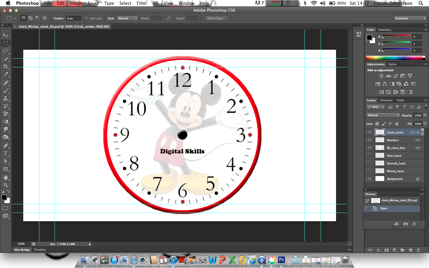
The next task was to animate a clock, we were told to down load a folder off of the UCA website and open the files to After Effects. I saved the folder to my desktop and opened it to Photoshop where i could see all of the layers - print screen demonstrates below.ju
I then opened After effects and imported the photoshop file as a new composition. Due to saving it as a photoshop file it meant that i could see all of the different layers on After Effects as well as photoshop which makes it much easier to animate. Once i had opened the folder onto after effects and re-names the composition we used the 'shape tool' and made a thin rectangle to imitate the second's arm. We then had to use a 'anchor point' so that when i go to animate the layer it rotates around one point, which in this case it obviously the centre of the clock. Once i had gone this, i duplicated the layer by selecting the layer and using 'cmd+d'. This meant that i had three second's hands which all had the same anchor point, so i renamed on 'hour hand' and the other 'minute hand' and manipulated the rectangles accordingly.

The image above is a screen shot of the short animation to display the different handles.
Once i had made all of the different 'arms' for the clock i then started the animate. The duration of the animation was 6 seconds long, which is the task is to animate a clock at 5 seconds to five o'clock.
I moved the curser to 1 second on the duration time, and then rotated the second hand to 4 seconds too five and 'key framed' the image. This means that the second hand will move to the key frame after 1 second. I did this until i had animated the second hand to end at number '12'. I then did the same process to the minute hand and the hour hand, (moving the hands accordingly).
However, instead of looking like a clock, it looked more like a stop watch, the play back was so smooth it did not look right. So Jon showed us a really good way of adding some character to our clocks. On After Effects, it will make a smooth transition from key frame to key frame. I had to change this, so i copy and pasted the beginning key frame and pasted it just in front of the second key frame; i then copy and pasted the second key frame and put it in from of the third key frame. So the sequence looked like this... 1 - 1,2 - 2,3 - 3,4 - 4,5 - 5. This created a sightly jolted movement rather then a smooth movement - i only did this on the second's arm. 
Still it didnt look quite right, so we i added more 'key frames' into the animation. Instead of going from keyframe 1 to key frame 2, i made the second key frame go slightly past key frame 2 and then made the third key frame, the original number two. So the sequence looked more like...
1  -  2.5,2  -  3.5,3  -  4.5-4  -  5.5-5. 
I ended up with this short animation.


(THE SCREEN COMES UP WITH MULTI COLOURS, IT DOES PLAY IF YOU PRESS PLAY.)